Designing a Modern Public Dictionary in rurussian.com
Published on April 1, 2026
Original post: https://henriwang.substack.com/p/designing-a-modern-public-dictionary
You may watch the video in summary: The dictionary feature of rurussian.com
Rethinking What a Dictionary Is
Most dictionaries are designed around a simple user intent: look something up, get an answer, move on. The interaction is fast, transactional, and shallow. But when you look closely at how people actually learn Russian, that model starts to break down. Russian is not a language where meaning lives neatly in isolated words—it lives in forms, patterns, and relationships.
This is the core problem that rurussian is trying to solve.
Instead of optimizing for quick lookup, rurussian is designed as a learning system disguised as a dictionary. It blends the roles of a lexical database, a grammar guide, and a curated corpus into a single, cohesive experience. From a product perspective, this is a deliberate shift: the goal is not just to answer questions, but to build understanding over time.
Designing for the Real User Problem
If you frame the user journey honestly, a learner rarely asks:
“What does this word mean?”
More often, they are trying to answer questions like:
“Why does this verb change form here?”
“What’s the difference between these two similar verbs?”
“Which case should I use after this word?”
“How is this actually used in a sentence?”
Traditional dictionaries don’t handle these well because they treat words as isolated units. rurussian, by contrast, treats each word as part of a system, and designs the interface accordingly.
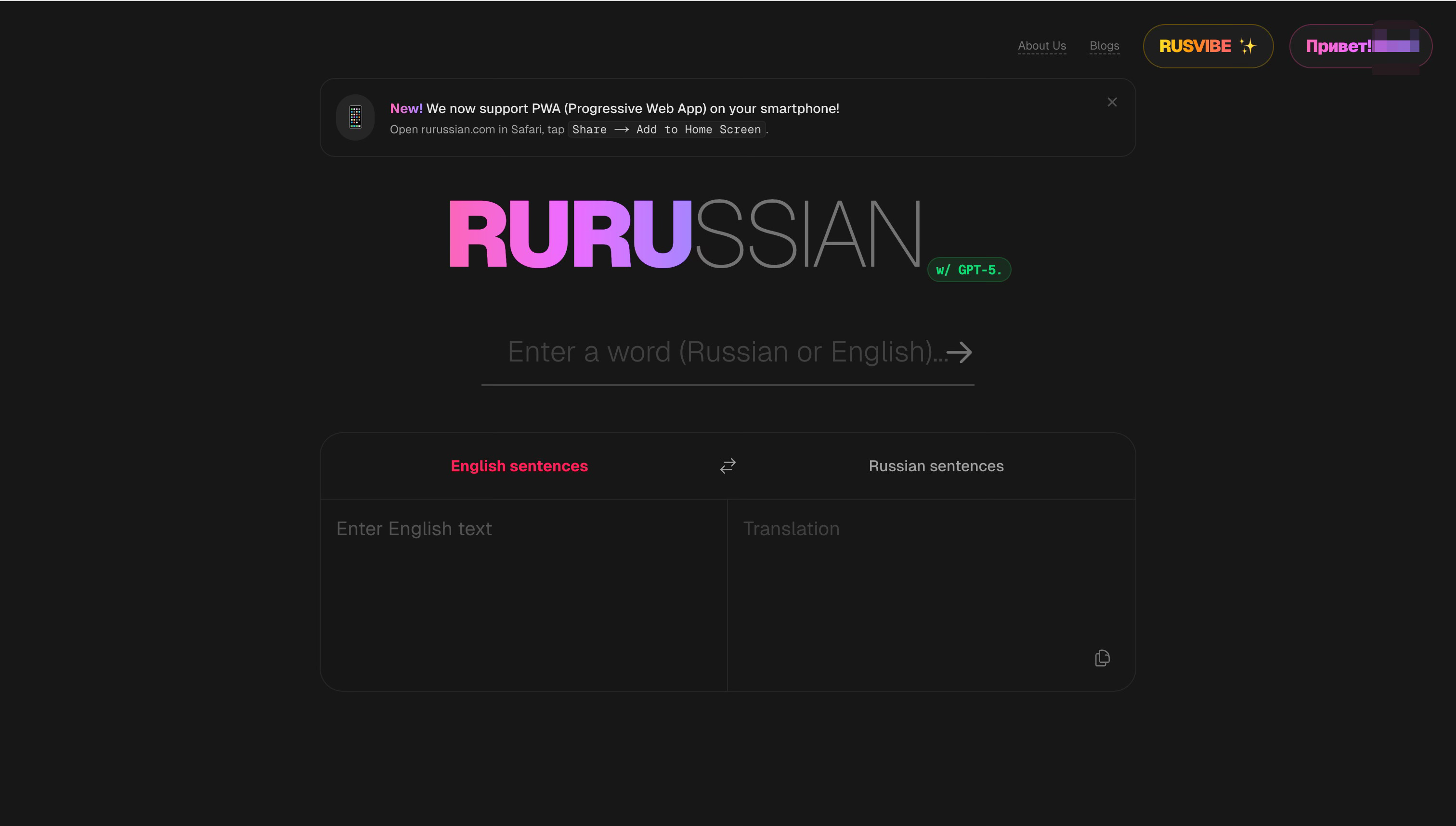
Search as the First Moment of Trust
The search experience is where the product establishes credibility. rurussian allows users to input inflected forms, not just base forms, and still arrive at the correct entry. As users type, they receive real-time suggestions that guide them toward the intended word.
From a design standpoint, this removes a major source of friction: users don’t need to already understand morphology to use the tool. The system quietly does the heavy lifting—resolving forms back to a canonical entry—so the experience feels intuitive even for beginners.
This is a subtle but important choice: the product meets users where they are, rather than requiring them to adapt to the system.
Turning a Word Entry into a Learning Surface
Once a user lands on a word, the design shifts from retrieval to exploration. Each entry is structured not as a block of text, but as a layered interface.
At the top, users see the essentials: pronunciation, stress, and a high-level meaning. But as they scroll or expand sections, more depth becomes available:
full conjugation or declension tables
aspectual relationships for verbs
grammar notes and usage constraints
example sentences in context
This is a classic case of progressive disclosure. Beginners are not overwhelmed, but advanced learners are not constrained. The same page supports multiple levels of expertise without fragmenting the experience.
Designing Around Verbs (Because That’s Where Users Struggle)
From a product perspective, verbs are the highest-friction area in Russian learning. rurussian addresses this head-on by making verb relationships explicit and navigable.
Instead of listing verbs separately, the interface connects them:
imperfective ↔ perfective pairs
multiple perfectives linked to a single base
prefix-based variations with distinct meanings
Users can click between these forms and compare them directly. This transforms what is usually a memorization problem into a navigation problem—and navigation is something interfaces are very good at supporting.
A key design decision is to make example sentences central, not supplementary. Rather than treating examples as decoration, RuRussian uses them as the primary way users understand meaning.
The sentences are curated to be clear and controlled, grammatically focused, and appropriate to the learner’s level. This effectively turns each entry into a micro learning module, where users learn by observing patterns in context. It’s a shift from “definition-first” to “usage-first” design.
One of the biggest UX challenges in language tools is how to present grammar without overwhelming the user. RuRussian solves this by embedding grammar directly into the word experience.
Instead of sending users to a separate grammar section, the platform surfaces:
case requirements
verb government patterns
prepositional dependencies
right where they are needed.
This keeps the learning loop tight. Users don’t have to context-switch—they can resolve questions in place, which is critical for maintaining engagement. rurussian includes a “Notes from Users” section, where learners can contribute explanations and tips. These contributions are ranked through voting, ensuring that helpful insights rise to the top.
What’s notable here is the balance: the platform is curated at its core, with community input layered on top. This avoids the chaos of fully open systems while still capturing the value of shared learning.
From a product standpoint, this is a hybrid model: a top-down structure for quality, and a bottom-up input for nuance and coverage
The GPT-5-powered sentence generator adds a dynamic element to the platform. Users can generate new example sentences tailored to their needs, extending beyond the curated dataset. Importantly, this feature is integrated in a way that feels additive, not disruptive. The core experience remains grounded in reliable data, while AI provides flexibility and personalization. This reflects a thoughtful use of AI: not as a replacement for content, but as a tool for exploration and reinforcement.
One of the most important product decisions behind RuRussian is what it does not optimize for. It is not designed for the fastest possible lookup. Instead, it prioritizes depth of understanding.
This introduces trade-offs between interactions are slower, pages are denser, and users are encouraged to stay longer. But these are intentional. The product is optimized for learning sessions, not quick queries.
A Different Kind of Dictionary
When you step back, rurussian is best understood not as a better version of an existing category, but as a redefinition of the category itself. It transforms the dictionary from a static reference tool into a structured, interactive learning environment. From a product design perspective, its key innovation is aligning the interface with the true structure of the language. Instead of simplifying Russian to fit a traditional dictionary model, it builds a system that reflects the language’s complexity—and then makes that complexity navigable.
Conclusion
rurussian demonstrates what happens when you design a dictionary around learning, not lookup. Every decision—from search behavior to page structure to feature integration—supports a deeper goal: helping users understand how the language works as a system.
In that sense, the product is not just delivering information. It is shaping a mental model in the user’s mind—one that is closer to how Russian actually functions. And that is what makes it a compelling example of modern product design in the language learning space.